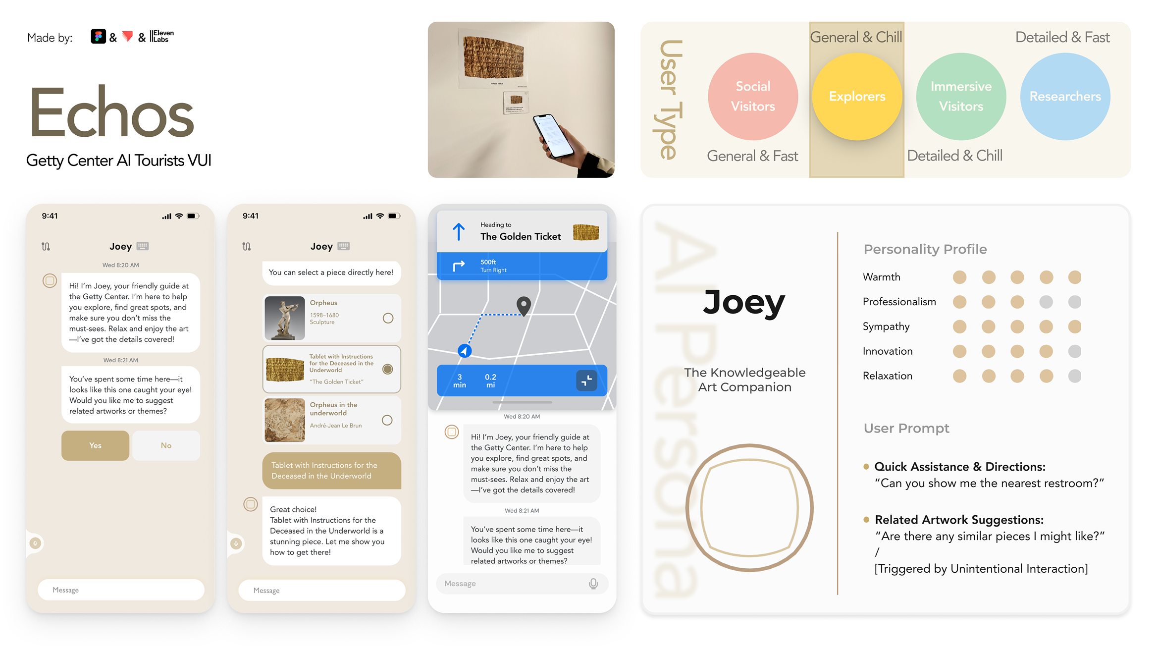
Echos is a Museum AI Tour App that aims to provide a Deeply Immersive Experience for our audience.
Overview
"Echos" is an HCI project developing an AI museum tour app focused on local museum experiences. Using voice interface design, we explored how conversational AI can create more immersive and personalized museum visits.
Personal Contribution
Initial Research
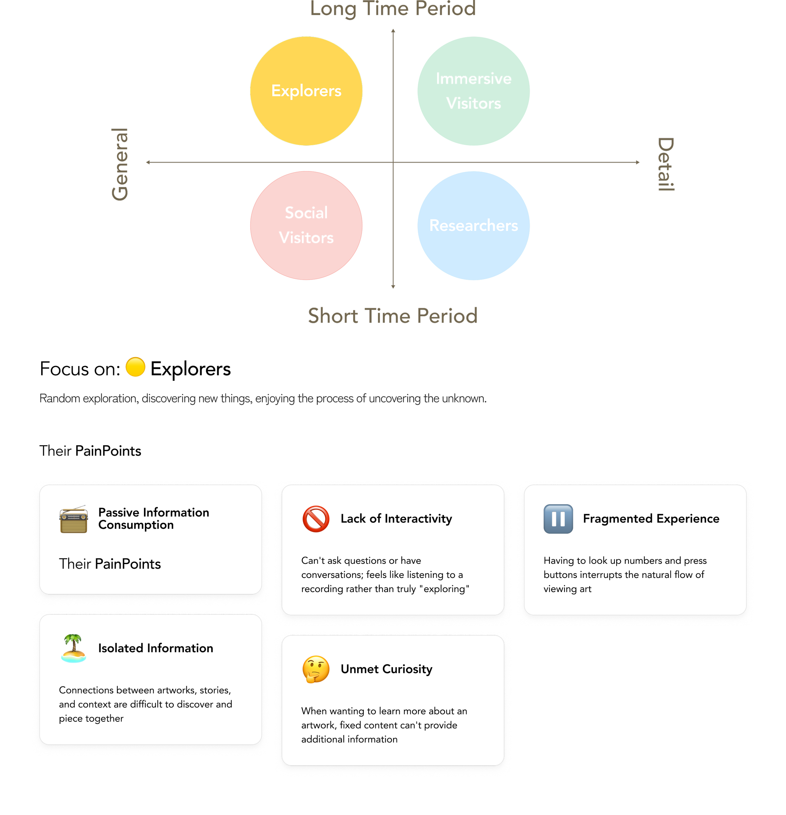
Concluded user types
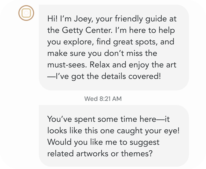
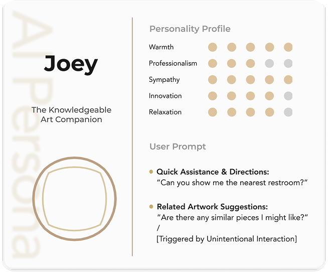
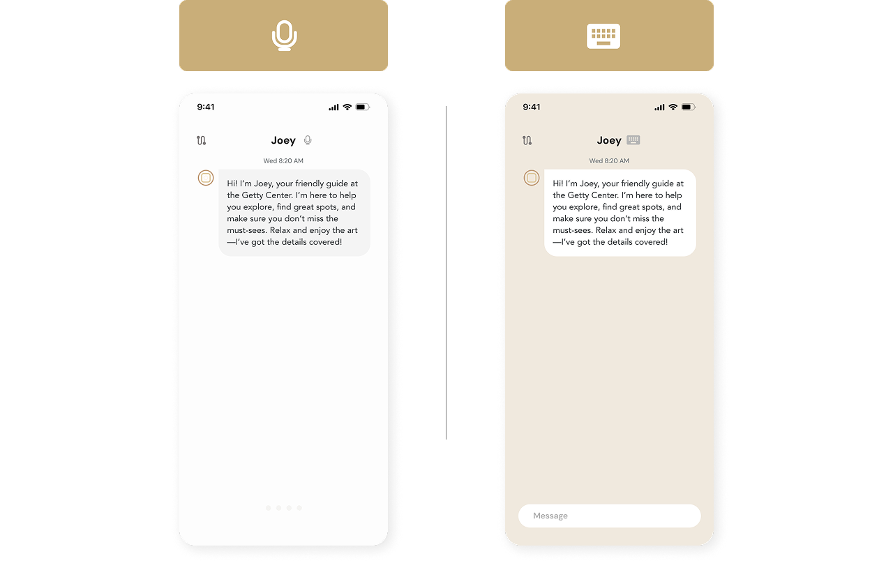
Design the Voice User Interface of “Joey” (Personas, Interfaces, User Prompts and Prototype)
Design Documentation
UserType
To personalize the journey, we categorize visitors into Four Distinct User Types and focused on one.
AIBotPersona
Based on the user type, we designed an AI companion that adapts its personality and communication approach to create personalized museum experiences.
UserTests
Core Features & Design Validation
Refining Overall Flow
Finalizing Features & Design Choices
Prototype
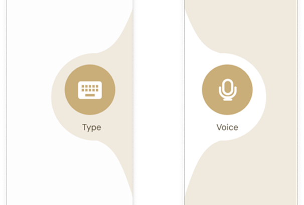
Test1: Keyboard Input / Voice Input (A/B)
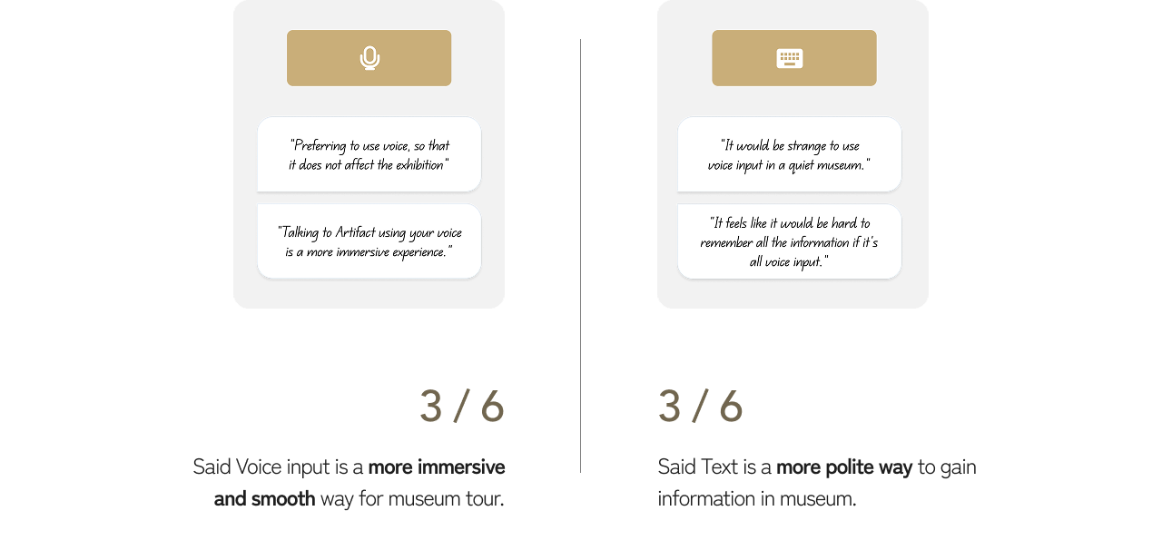
Split preference (50% each) confirmed our multimodal approach was the right decision
Voice users valued immersive, conversational flow without breaking focus from artwork
Text users prioritized social appropriateness and ease of information retention
Test 2: Input Mode Change Method
Round 1: Initial Discovery
Users showed extreme preferences (8/10) for their chosen input method
Users won't frequently switch between modes, they'll stick to their preferred method based on personality and context
Test 3: Tap Mode Button
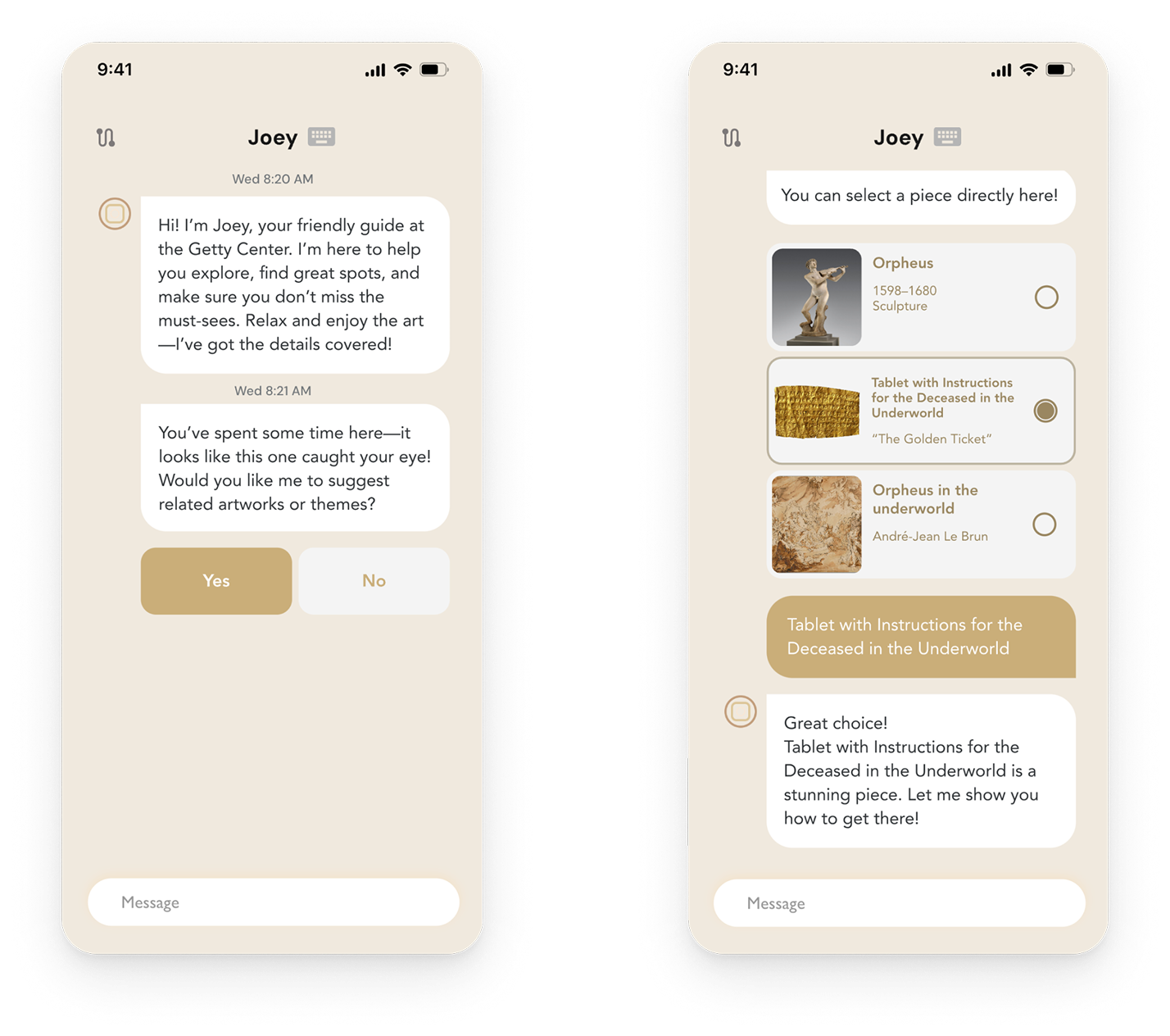
Excessive Typing Breaks Immersion (9/10)
Users felt constant text input disrupted the museum experience
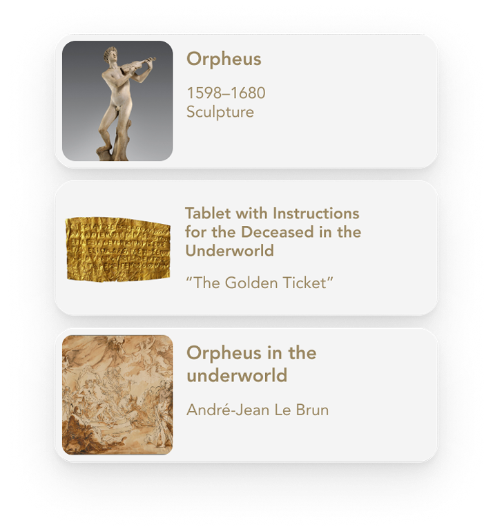
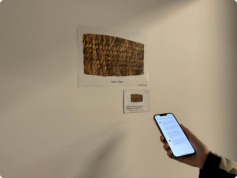
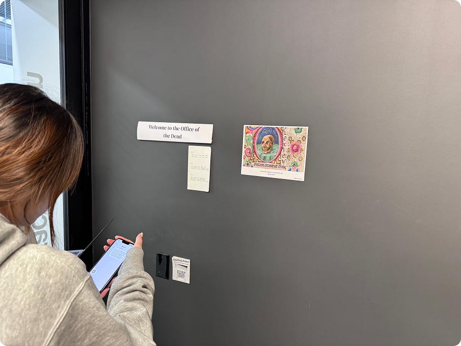
Long artwork names were hard to remember and type out ("Tablet with Instructions for the Deceased in the Underworld")
Users wanted clickable options instead of typing everything
Round 2: Horizontal Card Scroll - Mental Model Mismatch (9/10)
Option cards presented horizontally didn't align with chat app conventions
Users expected vertical scrolling like typical messaging interfaces
Horizontal interaction felt foreign in a chat context
Round 3: Card Format Confusion (7/10)
While users could understand it's a card layout, they felt compelled to pick one due to task framing
Simple Binary Choices (6/10)
For yes/no questions, users found typing unnecessary friction
Expected direct button selection for simple responses
"It's easier to choose instead of type"
Round 3: Interaction Design Refinement
Drag interaction didn't match users' mental model (7/10)
Show the mode switcher only during active input to maintain clean UI while ensuring accessibility when needed